Contents
- 1 Why a Dedicated Landing Page is Your Secret Weapon (Especially for Info Products)
- 2 The Core Elements: What Every High-Converting Landing Page Needs
- 3 Bringing It All Together: Your Step-by-Step Landing Page Checklist
- 4 Your Ultimate Info Product Landing Page Checklist
- 5 Never Stop Tweaking: The Power of Testing
- 6 Conclusion: Get Building and Start Converting!
So, you’ve poured your heart and soul into creating a fantastic info product – maybe an e-book, an online course, a must-see webinar, or an insightful guide. High five! That’s a massive accomplishment. But let’s be real, creating the product is just half the battle. The next big question is: how do you get folks to actually hit that ‘sign up’ or ‘buy now’ button? Enter the mighty landing page. Imagine it as your star salesperson, tirelessly working around the clock to draw people in and persuade them to take that crucial next step.
If you’re just starting out, landing pages might seem like a whole other language. What exactly goes on one? How do you make sure it actually works? Breathe easy. This guide is tailor-made to get you comfortable and confident. We’re going to unpack everything you need for a landing page that converts visitors, especially for info products. And yes, by the time we’re done, you’ll have a comprehensive Landing Page Checklist to ensure your pages are primed to transform curious onlookers into eager leads or paying customers.
Why a Dedicated Landing Page is Your Secret Weapon (Especially for Info Products)
Now, you might be thinking, “Can’t I just use my homepage?” Well, your homepage is like a busy town square – lots of different paths, signs for your ‘About Us,’ blog, contact details, maybe a few different products. A landing page, on the other hand, is a direct, private road to one specific destination. For your info product, that destination is usually:
- Getting folks to hand over their email for a juicy freebie (think lead magnets like a free guide, a handy resource similar to this Landing Page Checklist, webinar access, or a sneak peek chapter).
- Making that sale for your premium course, e-book, or membership site.
So, why bother with this dedicated page approach? What makes it so special?
- Laser Focus: It’s all about cutting out the noise. With only one clear action to take, visitors are way more likely to actually do it. No distracting menus or competing shiny objects here.
- Crystal Clear Message: A landing page talks to a specific person about a specific thing. The vibe and language are perfectly matched to whoever clicked your ad or link. It just gets them.
- Easy-Peasy Tracking: Want to know if your page is working? It’s a breeze to measure the success (hello, conversion rates!) of a single landing page compared to deciphering the complex dance of a homepage.
- Pinpoint Targeting: You can whip up different landing pages for different crowds. One for your Facebook ad audience, another for your email list, each with its own customized message. Smart, right?
When you’re offering knowledge or access, like with info products, trust and showing undeniable value are king. A thoughtfully built landing page is your prime tool for achieving exactly this.
The Core Elements: What Every High-Converting Landing Page Needs
Alright, let’s get into the nitty-gritty. While landing pages can come in all shapes and sizes, the ones that truly knock it out of the park share some common DNA. These are the building blocks that work together to win over your visitor. Think of these as the core items that will eventually populate your Landing Page Checklist.
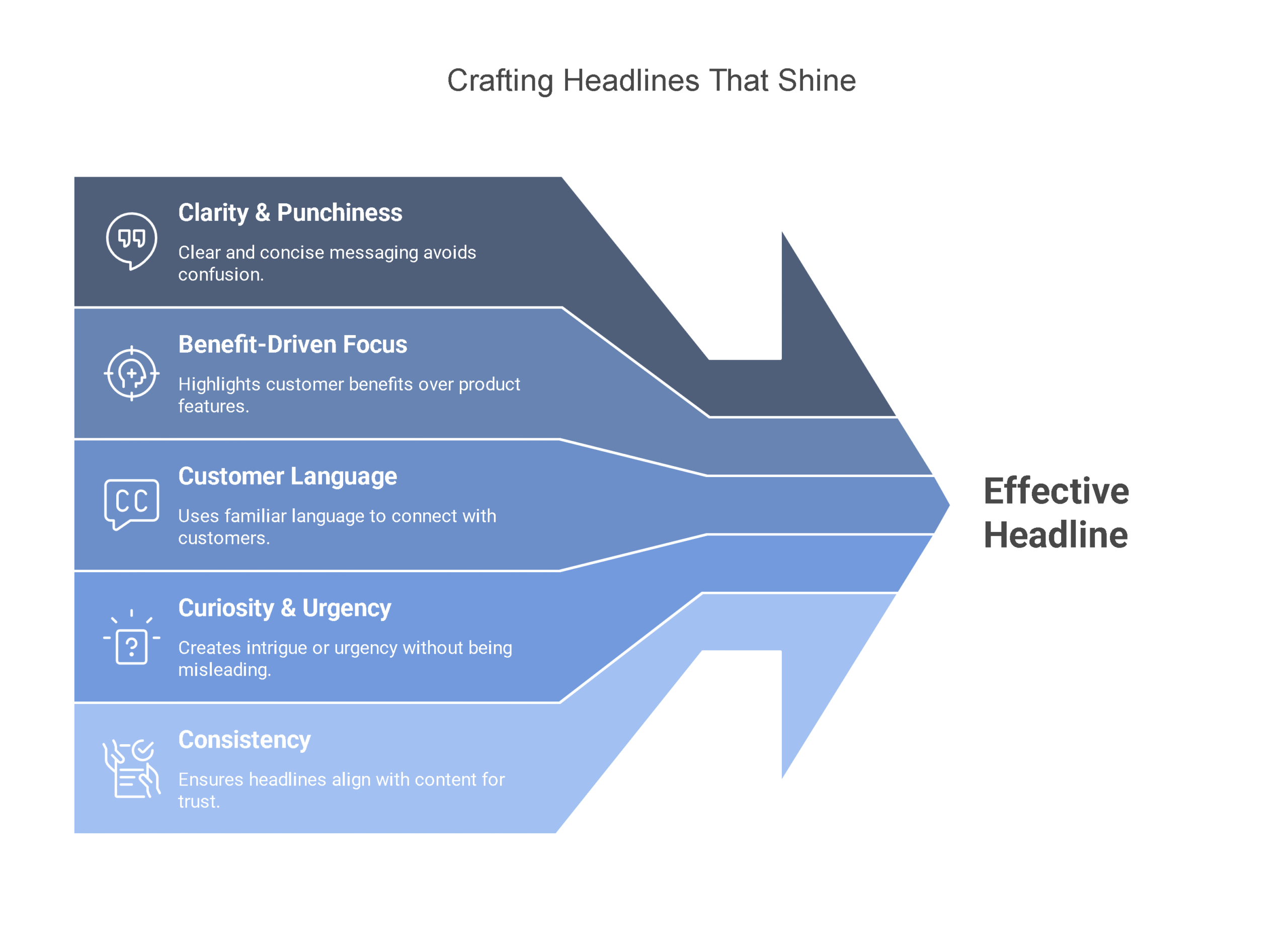
1. The Headline: Your Digital Handshake (Make it Count!)
This is it – ground zero. Your headline is often the very first thing people see, and you’ve got mere seconds to convince them to stick around. It needs to grab ’em by the collar and shout the main benefit loud and clear.
What Makes a Headline Shine?
- Crystal Clear & Punchy: Ditch the confusing jargon or overly clever puns. Get straight to what matters.
- Benefit-Driven, Not Feature-Focused: Don’t just say “Learn Social Media.” Try something like, “Skyrocket Your Social Media Engagement in 30 Days – Finally!” It’s about what they get.
- Talk Their Language: Use words and phrases that your ideal customer actually uses. Show them you understand their world, their problems, their aspirations.
- Spark Curiosity or Gentle Urgency (When it Fits): A little intrigue or a hint of ‘don’t miss out’ can go a long way, if it’s genuine and relevant to your offer.
- Matchy-Matchy with the Source: If your ad promised a “Free Keto Recipe E-book,” your headline better echo that loud and clear. No bait-and-switch! Consistency builds trust.
Headline Sparks for Info Products:
- “Unlock the Secrets to Effortless Meal Planning (And Grab Your Free Weekly Planner!)”
- “Your A-Z Blueprint for Launching a Profitable Online Course (Even if You’re Starting from Scratch)”
- “Stop Drowning in Social Media Overwhelm: Get Our Proven Content Strategy Cheatsheet Now”
- “Finally! Learn Conversational Spanish in Just 15 Minutes a Day – Sound Too Good to Be True?”
Insider Tip: A great headline often teams up with a slightly smaller sub-headline. This wingman adds a bit more tasty detail or context, further enticing the reader.
2. Irresistible Copy: Weaving a Story & Solving Their Problems
If your headline got them to pause, next step in landing page checklist it’s the copy’s job to draw them in deeper. This is where you expand on the amazing benefits, really dig into your visitor’s pain points (and agitate them a little), and then clearly present your info product as the ultimate solution. We recommend the book Landing Page Optimization: The Definitive Guide to Testing and Tuning for Conversions by Tim Ash.
What Goes Into Landing Page Copy That Sells?
- Benefits, Benefits, Benefits (Not Just Features): A feature is what your product has (e.g., “10 video modules”). A benefit is how it makes their life better (e.g., “Master a new skill in under a week, learning at your own pace”). Always bridge that gap and show them ‘what’s in it for me?’
- Empathize with Their Pain: Show you truly get their struggles. “Fed up with tech tutorials that feel like rocket science?” or “Is finding time to write your book a constant battle?” This builds rapport and makes your solution more appealing.
- Plain English, Please: Use short, crisp sentences and paragraphs. Break up big walls of text with bullet points or numbered lists. Steer clear of dense academic language unless your audience specifically expects (and loves) it.
- Get Specific & Quantify: Instead of vaguely saying “improve your marketing,” try “Learn the 3 battle-tested techniques to double your lead generation this month.” Numbers and specifics are much more persuasive.
- Show, Don’t Just Tell (Social Proof!): This is massive for info products! Weave in glowing testimonials from happy students, impressive case studies, logos of media outlets that featured you, or even the sheer number of folks who’ve already benefited. It’s all about building trust and credibility.
- What’s in the Box?: Be crystal clear about everything they get – number of lessons, downloadable PDFs, community access, special bonuses. Leave no room for doubt.
3. The Call-to-Action (CTA): Clearly Show Them the Next Step
The CTA is where the magic happens. It’s the instruction that tells your visitor precisely what you want them to do. Usually, it’s a button, but sometimes it might be an embedded form.
Anatomy of a Killer CTA in Landing Page Checklist:
- Action-Packed Words: Kick it off with a strong verb. Think “Download,” “Get,” “Sign Up,” “Access,” “Register,” “Buy,” “Start Learning,” “Claim Your Spot.”
- Reinforce the Value: Don’t just say “Submit.” How boring! Try “Get Your Free Guide Now” or “Start My 7-Day Free Trial” or “Yes, I Want to Master [Skill]!”
- Make It Pop: Your CTA button needs to be a beacon. Use a contrasting color that stands out from the page, and give it some breathing room. Don’t make people hunt for it.
- Strategic Placement: Definitely have one “above the fold” (visible without scrolling). For longer pages, it’s smart to repeat your CTA further down.
- Keep It Simple (Especially for Leads): If you’re gathering leads, name and email are often plenty. Don’t scare them off with a giant form. For sales, ensure the path to purchase is as smooth as silk.
CTA Examples That Work for Info Products:
- “Download Your Free E-book Now!”
- “Get Instant Access to the Course Modules”
- “Save My Seat for the Free Webinar!”
- “Send Me My Free Checklist!”
- “Yes! I’m Ready to Transform My [Area of Life]!”
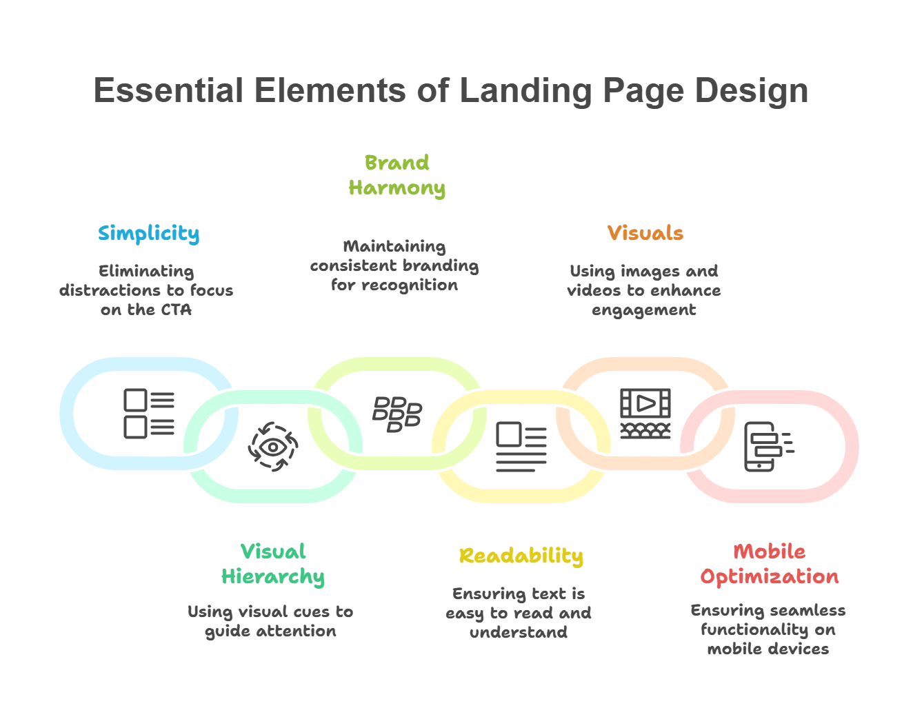
4. Design & Layout: Clean, Focused, and User-Friendly
Great design isn’t just about making things look “pretty.” It’s about strategically guiding your visitor’s attention, making information digestible, and paving a smooth path to that CTA.
Landing Page Design 101:
- Simplicity is Key: Eliminate every single distraction. That means no website navigation menu, no sidebar with random links, no busy footer. The only choices should be to act on your CTA or leave.
- Visual Roadsigns (Hierarchy): Use size, color, contrast, and strategic placement to naturally draw the eye to the most important stuff first: Headline -> Key Benefits/Problem Agitation -> Social Proof -> CTA.
- Brand Harmony: Stick to your brand’s colors, fonts, and logo. This builds recognition and a sense of familiarity and trust.
- Readability Rules: Pick fonts that are easy on the eyes. Ensure there’s enough contrast between your text and its background. And please, embrace white space – it lets your content breathe and prevents overwhelm.
- Power of Visuals (Images/Video): A well-chosen image (like a mockup of your e-book or a sneak peek of your course platform) or a short, punchy explainer video can do wonders for engagement and help people visualize the value. Just make sure they load fast!
- Mobile is Non-Negotiable: A massive chunk of your visitors will be on their phones. Your landing page absolutely must look incredible and function flawlessly on all devices. Test it like your conversions depend on it (because they do!).
Bringing It All Together: Your Step-by-Step Landing Page Checklist
Feeling a bit more confident? Let’s walk through how to actually build this thing:
- Nail Down Your ONE Big Goal: What’s the single most important thing you want someone to do on this page? (e.g., Download the PDF, Register for the webinar, Buy the course). Clarity here is everything.
- Get Inside Your Audience’s Head: Who are you actually talking to? What keeps them up at night? What are their biggest dreams related to your topic? Write for them.
- Craft That Killer Headline (and Sub-headline): Remember, focus on the #1 benefit or solution. Write a bunch, then pick the one that packs the most punch.
- Write Copy That Connects & Converts: Map out your key talking points. Transform features into irresistible benefits. Poke at their pain points (gently!), then present your info product as the hero. Sprinkle in that social proof. Keep it easy to scan.
- Design Your Can’t-Miss CTA: Strong action verbs are your friend. Make the benefit crystal clear right on the button. Pick a color that shouts “click me!”
- Sketch Out the Flow (Layout): Grab a piece of paper or a whiteboard. Where will everything go? Headline, main copy, crucial images or video, those trust-building testimonials, and the CTA(s). Ensure a logical journey for the visitor’s eyes. Prioritize getting key info above the fold.
- Become a Distraction Destroyer: Be ruthless. If it doesn’t directly support your ONE goal, it’s gotta go. That means main navigation, complex footers, links to other blog posts – all gone.
- Pick Your Power Visuals: Choose a high-quality image, or create/embed a relevant video that truly enhances your message and doesn’t just fill space.
- Build It & Test It (Especially on Mobile!): Use your favorite landing page builder or WordPress tools. Then, critically, view it on different phones and tablets. Click everything. Does it work smoothly? This step will inform your final Landing Page Checklist review.
Your Ultimate Info Product Landing Page Checklist
Before you hit that ‘publish’ button and send your page out into the world, let’s run through your essential Landing Page Checklist. This isn’t just any list; it’s your final quality control to ensure every piece of the puzzle is in place for maximum impact.
- [ ] The Headline Hook: Is your headline undeniably clear, super compelling, and shouting benefits? Crucially, does it perfectly match the ad or link that brought the visitor here?
- [ ] Compelling Copy – Benefits First: Does your text sing about the amazing benefits for the user, rather than just listing dry features?
- [ ] Compelling Copy – Pain Point Solver: Does your content clearly show you ‘get’ your audience’s struggles and position your offer as the answer?
- [ ] Compelling Copy – Scan-Friendly?: Is the text a breeze to read? Think short, punchy paragraphs, bullet points, and clear headings.
- [ ] Trust Builders (Social Proof): Have you woven in testimonials, impressive logos, or numbers (like happy students or downloads) to build that all-important trust?
- [ ] Crystal Clear Offer: Is there zero doubt about what the visitor gets if they take action? Is it spelled out plainly?
- [ ] The All-Important CTA: Is your Call-to-Action button (or form) unmissable, action-packed with strong verbs, and visually distinct?
- [ ] CTA Value Proposition: Does the CTA button itself scream value? (e.g., ‘Get Your Free Blueprint’ vs. ‘Submit’).
- [ ] Clean & Focused Design: Is the overall look tidy, professional, and does it guide the eye towards the CTA? Is it visually appealing without being distracting?
- [ ] Zero Distractions Zone: Have you ruthlessly removed all escape routes? No sneaky navigation menus, unrelated links, or busy footers?
- [ ] Engaging Visuals: Are your images or videos top-notch, relevant, and actually adding value (not just taking up space)?
- [ ] Mobile Masterpiece: Seriously, does this page look and feel fantastic on a smartphone or tablet? Test it, then test it again!
- [ ] Speedy Gonzales Loading: Does your page snap to attention and load quickly? Slow pages kill conversions.
- [ ] The One True Goal: Does every single word, image, and element on this page drive towards that one specific conversion goal you set?
Treat this Landing Page Checklist as your best friend in the launch process. Go through it meticulously!
Never Stop Tweaking: The Power of Testing
Getting your landing page live is a huge win, but it’s not the finish line. The real breakthroughs often come when you start experimenting with different elements to see what truly clicks with your audience. This is called A/B testing (or split testing), and it’s simpler than it sounds.
Even tiny tweaks can lead to surprisingly big improvements in your results. Think about testing things like:
- Different headline approaches
- Copy variations (e.g., longer vs. shorter, focusing on different pain points)
- CTA button wording, color, or even shape
- The images or videos you use
- Slightly different layouts
- How much info you ask for in your sign-up form
Many landing page platforms have A/B testing tools built right in. The key is to start small: change just one thing at a time and watch how it impacts your conversion rate (that’s the percentage of visitors who do what you want them to do). Let the data guide you!
Conclusion: Get Building and Start Converting!
A well-thought-out landing page isn’t just a ‘nice-to-have’; it’s a fundamental powerhouse for anyone selling info products online. It brings sharp focus, undeniable clarity, and provides a direct, persuasive route for turning curious visitors into loyal leads or happy customers. By really nailing the essential elements we’ve covered – a magnetic headline, benefit-rich copy, an unmissable call-to-action, and a clean, conversion-focused design – even if you’re new to this, you can craft pages that genuinely deliver results.
Don’t get bogged down striving for “perfection” right out of the gate. Use this guide and your trusty Landing Page Checklist to get your first version up and running. Launch it, then embrace the ongoing process of testing, learning, and refining based on what your audience actually responds to. Your future customers (and your bottom line) will be incredibly grateful you did!